Typography
Typography is an important part of a design system that brings consistency across experiences and platforms. Good typography rules help present content clearly and efficiently.
Typefaces
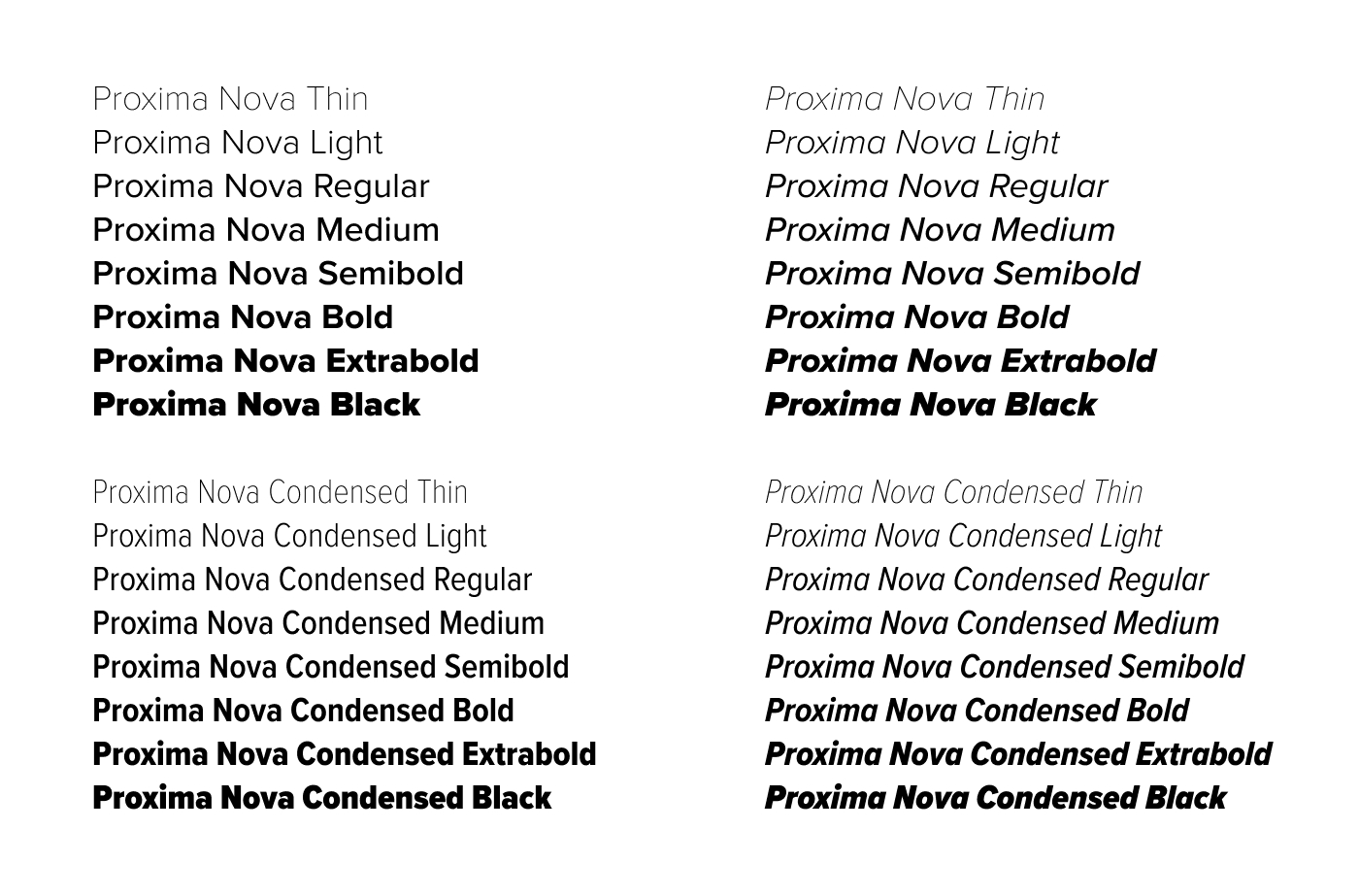
Proxima Nova is the primary font family of the UA web design system, and can be used anywhere text exists.
Proxima Nova Condensed may be used for short accents like labels or short lead-ins.
:root {
  --ua_font--heading: proxima-nova, sans-serif;
  --ua_font--body: proxima-nova, sans-serif;
  --ua_font--accent: proxima-nova-condensed, sans-serif;
  --ua_font--mono: monospace;
  --ua_font--icon: "Font Awesome 6 Pro";
  --ua_font--icon-brands: "Font Awesome 6 Brands";
  --ua_font--icon-duo: "Font Awesome 6 Duotone";

  --ua_weight--thin: 100;
  --ua_weight--light: 300;
  --ua_weight--regular: 400;
  --ua_weight--medium: 500;
  --ua_weight--semibold: 600;
  --ua_weight--bold: 700;
  --ua_weight--extrabold: 800;
  --ua_weight--black: 900;
}
Typography
:root {
  --ua_font-size--xsmall: 0.75rem;
  --ua_font-size--small: 1rem;
  --ua_font-size--normal: 1.25rem;
  --ua_font-size--medium: 1.5rem;
  --ua_font-size--large: 1.75rem;
  --ua_font-size--xlarge: 2rem;
  --ua_font-size--xxlarge: 2.25rem;
  --ua_line-height--xsmall: 1rem;
  --ua_line-height--small: 1.5rem;
  --ua_line-height--normal: 2rem;
  --ua_line-height--medium: 2rem;
  --ua_line-height--large: 2.25rem;
  --ua_line-height--xlarge: 2.5rem;
  --ua_line-height--xxlarge: 2.5rem;
}

@media (min-width: 77rem) {
  :root {
    --ua_space--section: var(--ua_space--16, 8rem);
    --ua_font-size--large: 2.25rem;
    --ua_font-size--xlarge: 3rem;
    --ua_font-size--xxlarge: 4.5rem;
    --ua_line-height--large: 2.75rem;
    --ua_line-height--xlarge: 3.5rem;
    --ua_line-height--xxlarge: 4.5rem;
  }
}
Usage Guidelines
Don't use unique font sizes
Choose from the defined font sizes. By using unique font sizes, you risk upsetting the hierarchy and balance of typography in your product.
Don't use underlines for adding emphasis
Underlines are reserved for text links only. They should not be used as a way for adding emphasis to words.
Don't let paragraph widths get too thin
Paragraphs of text that are too long are difficult to follow, and paragraphs of text that are too thin are difficult to read. Ideally, blocks of text should be roughly 70 characters wide. Be sure to keep them at least between 50 and 120 characters wide.
Define appropriate heading levels
Regardless of their style, it is important to use correct heading levels for assistive technology.