Card
exclamation Caution
This component is under review and is subject to change
View this component in the Storybook sandbox
Browse the files and source code related to this component
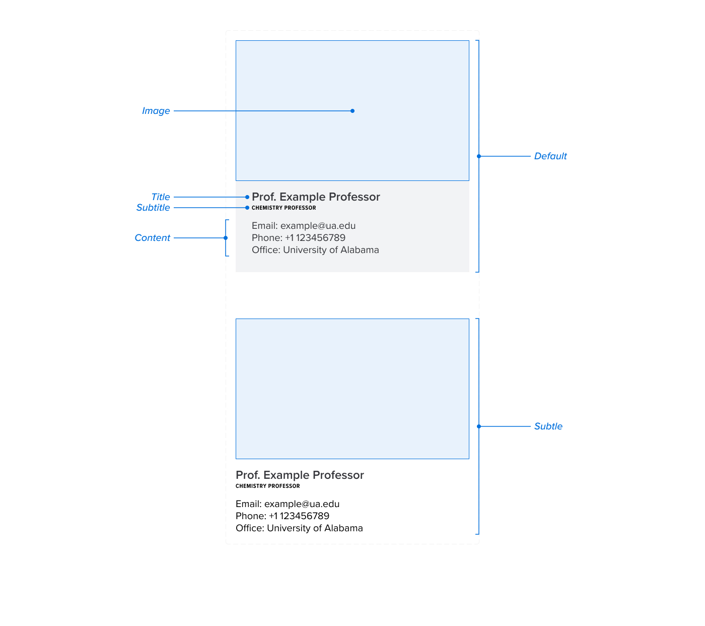
A Card can be used to display content in a structured way. It is a flexible component that can be used in a variety of contexts.
Anatomy

Usage Guidelines
Cards are meant for short structured content. Often these are in a list or grid format. They can be used to display a variety of content, such as news articles, events, or profiles.
When to consider a different component
For a list of links, consider using the Link List component. Which saves space and is more accessible.
For links that don't require an image, consider using the Link Box component. It has lower visual weight and is easy to see when skimming.
Implementation
This component is available in WordPress as the Card block. It is a UA block supported by the Division of Strategic Communications.
<div class="ua_component_wrapper">
  <article class="ua_card">
    <div class="ua_card_content-wrapper">
      <h3 class=" ua_card_title">
        <a href="https://www.ua.edu">Card Title</a>
      </h3>
      <span class="ua_card_subtitle">Subtitle</span>
      <p>Card description. The quick brown fox jumps over the lazy dog.</p>
    </div>
    <div class="ua_card_image-wrapper">
      <img
        src="https://picsum.photos/1600/900"
        alt="Image Alt Text"
        style="aspect-ratio:16/9"
      />
    </div>
  </article>
</div>
<Card
  heading_level={3}
  title="Card Title"
  description={<p>Card description. The quick brown fox jumps over the lazy dog.</p>}
  subTitle="Subtitle"
  img={{ src: "https://picsum.photos/1600/900", alt: "Image Alt Text", aspectRatio: "16/9" }}
  href="https://www.ua.edu"
/>
React Component Props
- heading_level
number 1-6 (required) - The heading level of the card title
- title
string (required) - The title of the card
- subTitle
string - An optional subtitle for the card
- description
ReactNode - The body content of the card
- href
string - A destination for the card to link to
- newTab
boolean - If the href prop is provided, this determines if the link should open in a new tab
- img.src
string - The source for the card image
- img.alt
string - The alt text for the card image
- img.aspectRatio
string - The aspect ratio for the card image
- presence
"subtle" | undefined - The visual presence of the card
- isLandscape
boolean - Determines if the card will use the landscape layout
- align
center | left | right - Determines the text alignment of the card content
- className
string - Additional classes to add to the ua_component_wrapper
Variants
Subtle
The subtle variant removes the background and padding from the card.
<div class="ua_component_wrapper ua_presence--subtle">
  <article class="ua_card">
    <div class="ua_card_content-wrapper">
      <h3 class=" ua_card_title">
        <a href="https://www.ua.edu">Card Title</a>
      </h3>
      <span class="ua_card_subtitle">Subtitle</span>
      <p>Card description. The quick brown fox jumps over the lazy dog.</p>
    </div>
    <div class="ua_card_image-wrapper">
      <img
        src="https://picsum.photos/1600/900"
        alt="Image Alt Text"
        style="aspect-ratio:16/9"
      />
    </div>
  </article>
</div>
<Card
  heading_level={3}
  title="Card Title"
  description={<p>Card description. The quick brown fox jumps over the lazy dog.</p>}
  subTitle="Subtitle"
  img={{ src: "https://picsum.photos/1600/900", alt: "Image Alt Text", aspectRatio: "16/9" }}
  href="https://www.ua.edu"
  presence="subtle"
/>