Details / Summary
View this component in the Storybook sandbox
Browse the files and source code related to this component
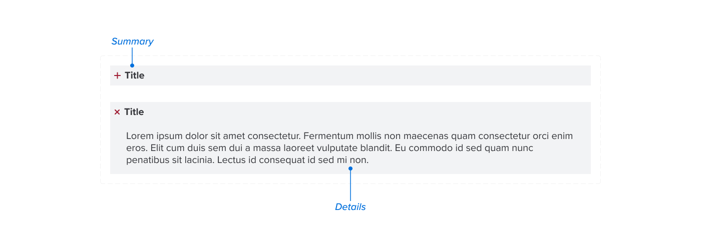
The Details component is a simple way to show and hide content. It is often used when you have a large amount of content that you want to hide until a user clicks on it.
Anatomy

Usage Guidelines
Details can be used to condense long content, and are ideal for long form question and answer content, or content that is geared toward a specific audience.
Info SEO notice
Details should be used only when necessary because search engines do not read information nested inside of the details component when crawling pages, which may have a negative impact on search engine optimization (SEO).When to consider a different component
Details content is not searchable with the built in browser search function, so it is important to consider the user experience when deciding to use them. If the content is important and should be searchable, consider using regular headings and paragraphs.
Implementation
This component is available in WordPress as the Details block. It is a core Gutenberg block, but it's markup has been adjusted to match the styling of the UA Framework.
<div class="ua_layout--flow">
  <div class="ua_component_wrapper">
    <details class="ua_details" open="">
      <summary>Summary / Title</summary>
      <div class="ua_details_content">Details Content</div>
    </details>
  </div>
  <div class="ua_component_wrapper">
    <details class="ua_details">
      <summary>Summary / Title</summary>
      <div class="ua_details_content">Details Content</div>
    </details>
  </div>
</div>
<div className="ua_layout--flow">
  <Details summary="Summary / Title" open={true}>Details Content</Details>
  <Details summary="Summary / Title">Details Content</Details>
</div>
React Component Props
- summary
string (required) - The accordion title, always visible
- children
ReactNode (required) - The content of the accordion, hidden when closed
- open
boolean - Determines if the details is open by default
- className
string - Additional classes to apply to the accordion
ua_component-wrapperelement
Interactivity
This component does not require JavaScript to function, since it gets it's functionality from built in browser behavior.
The accordion element is keyboard focusable and has the following interactions:
| Input | Behavior |
|---|---|
| Tab | Focuses the accordion element |
| Enter | Opens or closes the accordion |
| Space | Opens or closes the accordion |
| Click | Opens or closes the accordion |